Friday, May 14, 2010

Sculpture -- Like a Museum

We had studied a number of artists whose work was at the intersection between art and science. A good example of this is Herbert Distel and his Museum of Drawers. Another example was the Museum of Jurassic Technology in Los Angeles. As part of this assignment we had to form teams, study displays in museums and do a proposal for a display that was "like a museum". Our proposal was The Twinkies Project, in which we would document all the wild myths, unbelievable truths and slight exaggerations about Twinkies.


Some of the artifacts for our display included the Twinkie (on the left) that was found among the stomach contents of a 25,000 year old frozen Woolly Mammoth. Next to it is a Twinkie where the chemical process was stopped right in the middle so you could see the interior bubbling up. Next to it is a Twinkie that has been dissected. The items that were labelled include: Rocket Fuel, Glue, Embalming Fluid, Tracer Bullet Phosphorus, Colorants, Petroleum and "Just Chemicals". Next to it is a light that is being powered by the chemicals in the Twinkie. The light was able to stay on for the whole two week display. One thing that we asserted was that there is enough power in a package of Twinkies to run a VW bus cross-country. On the right we showed "Twheaties" a cross between Twinkies and Wheaties, a product that is available in some other countries. Finally in front you can see a Twinkie from which someone took a bite. We don't know what happened to them afterward.

Sculpture -- Book Art

In class we had studied the work of Tom Trusky and the Idaho Center for the Book. Our assignment was to create a sculptural work based on a book. Our professor passed out instructions on how to create an accordion book and a long list of possible topics. I went from there. Here are two photos of my book art sculpture. One photo shows the places & poems and the other photo maps & directions. my artist's statement is below.


The Book Art sculpture, Places, Maps & Memories, is an accordion book of sixteen pages. It is constructed of simplex-printed paper, glue, thread, tape and graphite. Each page is 3 1/2 x 5 inches. The construction includes eight photographs associated with places I have lived and eight traditional maps showing the locations of these places. In addition there is a poem associated with each place and a psychological map that shows the way to each location.


When the accordion book is closed and flat, it fits into a hand-made envelope which can be closed with a paper-button clasp and thread. This envelope is approximately 3 3/4 x 5 1/4 inches.


When the accordion book is opened, it ties together with a paper-button clasp and thread. When joined together it forms a symmetrical, standing sculpture approximately 11 x 11 x 3 1/2 inches. The sculpture should stand slightly below eye level. It is a closed form and should be viewed from all sides. It is interactive, and fragile.


When the accordion book is joined it has two continuous faceted surfaces. One surface has eight photos associated with places I have lived. Each photo has a poem associated with it and next to it. The other surface has eight traditional maps that show the location of these places. Each traditional map also has a psychological map that shows the way to it. These are located next to each other.


When joined, the structure forms a kind of circular tube where the inside may be pulled up to become the outside and the outside rotates under to become the inside. Because of the offset nature of the structure, the map associated with a particular place does not sit exactly opposite it. To tie the place with its maps, all are lightly color-coded. The colors, in order, are: red, orange, yellow, light green, dark green, light blue, dark blue and gray.


The sculpture is designed to explore the idea of home and place and how one moves from place to place and why.

Thursday, May 13, 2010

Drawing -- Moth

Our final assignment for the semester was to select a number of objects (piece of black paper, smaller piece of white paper, picture of a moth, a short length of rope and a disk with odd shapes on it), place them in a composition of our choosing and draw them in graphite on white paper. Our format was 14" x 17". We only had a short amount of time to complete this one, so I feel it is not quite finished yet. I'm glad the semester is over though.


Drawing -- Fabric

Our professor prepared a piece of black and white striped fabric, draped and mounted to a board. Our assignment was to draw it in charcoal on white paper with a toned background and in a 10" by 20" format. When I did it in class my toned background ended up so dark that when I tried to lighten it for the white stripes, I could not get it light enough. I had to do the drawing over, from scratch, outside of class, without being able to look at the actual fabric. In spite of that (or perhaps because of it ;^) the final drawing turned out very good. This is my best work for the semester.


Drawing -- Still Life with Dinosaur

Our assignment was to select a number of black and white objects, compose them and then draw them on a toned background. We used charcoal on newsprint. We used the charcoal to establish an even tone across all of the paper and then darkened and lightened portions to complete our drawing. This was practice for the following (fabric) assignment.


Drawing -- Master Drawing

We were given a black and white photocopy of an oil pastel by Mary Ann Currier called Onions and Tomato. We were then to do a 10" by 20" drawing of it. We could choose either graphite or charcoal. I chose graphite because I thought it would be harder for me. This was the only assignment where we used a grid. It made the assignment much more doable. This was the first time that I drew using a grid. I like the result.


Drawing -- White Objects

Our assignment was to draw a still life of white objects on a white table with a white background. The drawing was graphite on white paper. (Sorry that this photo is so poor.)


Drawing -- Bird

We were given a small photocopy of a bird. Our assignment was to use that bird in our composition and then in a free form fashion build a composition around it with shapes that were similar to or derived from the basic bird shape. The work was charcoal on white paper. This is what I came up with on my third try.


Thursday, April 8, 2010

Drawing -- Cross Hatch Bottles

Here is a drawing of bottles done using cross hatching. This probably was the least successful drawing I've done in class so far. The chaotic background did not seem to work as planne.


Tuesday, March 23, 2010

Drawing -- Contour Plant

This is a contour drawing of a plant in our class room. It is a good exercise.


Monday, March 8, 2010

Drawing -- Blind Contour Denise

Another blind countour drawing, this one of fellow student Denise. (She looks a lot better than this!)


Friday, March 5, 2010

Drawing -- Blind Contour Hand

Our assignment was to do several blind contour drawings (drawing without looking at your paper). This is my left hand without looking at what I am doing.


Sculpture -- Transformation

Our assignment was to take an everyday object or series of them and transform it. I chose drinking straws. My artist statement follows the photo of the sculpture.


The Transformation sculpture, Spiral Trapezoid, is a symmetrical, standing sculputure created from plastic drinking straws and glue with a paper-covered mat board base. The sculpture is mounted to the base and should stand slightly below eye level. Its dimensions are roughly 7” high x 10” wide x 10” deep. It is a mostly “closed” form and should be viewed from all four sides.
The sculpture was created from seventy-six drinking straws, including nineteen of each color: striped red, striped yellow, striped green and striped blue. Each trapezoid contains one straw of each color. Straws were trimmed so that as the spiral rises, the ends of the straws converge. Each straw was also notched twice with a paper punch, Lincoln-log style, so that the structure would have more stability.
The sculpture is designed to explore color and line. First each straw itself is a line in a trapezoidal structure and each straw has several straight, colored lines on it running from tip to tip. Second, these colored lines form the basis of the exploration of color in the sculpture. The colors are the three primary colors plus green. The order of the colors as the spiral is formed is always red, yellow, green and blue. As the colors revolve around the spiral, one complete rotation is created. Third, there are eight implied lines formed by the ends of the straws that rise in the shape of the spiral and converge slightly above the sculpture. The movement of these implied lines, up and toward the center, and converging above the structure, provide the “open” aspect of the form.


Tuesday, March 2, 2010

Drawing -- Three Forms on Paper

This was during our first week of drawing and an introduction to charcoal. We had a piece of paper, the same size as our drawing pad. Upon this we placed a piece of white paper and three objects arranged on it. The goal was to get a realistic drawing. Charcoal can be a little tricky as every little mark really shows up and once it is on the paper there is no going back.


Sculpture -- "Strong Center"

Our first assignment was to create a sculpture that emphasized both structure of the form (the skeleton) and the surface of the form (the skin). This is my sculpture, followed by the artist statement.


The Skeleton and Skin sculpture, "Stong Center", is an asymmetrical, hanging sculputure created from wire, glue, rough newsprint and watercolor. It should hang at approximately eye level. Its dimensions are roughly 22” high x 17” wide x 13” deep. It is designed to be viewed from all sides.
The sculpture is designed to explore several complementary and contradictory aspects of life. First it explores the relationship between self-control and creativity. The tightly wrapped center represents an individual’s self-control that allows him or her to achieve their full creative potential. The curvilinear soaring wires represent that creativity. The occassional supporting wire loops represent an individual’s experiment with new things and their return with confidence to their center to try new endeavors.
Second, it represents the contradiction to simultaneously be open and reveal one’s center and to keep it concealed. This requires the viewer to take some time to pause and look at the sculpture, to see what is really there. Third the colors are designed to invoke both nature (green) and society (purple). In some cases they overlap and in others they are quite disjoint. It should be noted that edges are torn in both nature and in society. Finally, the sculpture represents a distinction between what is revealed on the outside (which is often muted) compared with what is present on the inside (which can be more vibrant).


Tuesday, January 5, 2010

Art Foundations -- "Self Portrait"

More than a likeness


Our assignment was to create a kind of self portrait that was "more than a likeness". It needed to show two or more aspects of our personality but not what we looked like. We could use any media. I chose drawing and collage. This is my artist's statement:

This self-portrait collage explores two aspects of my personality, my analytical/engineering side and my creative/artistic side. The black that is revealed near the edges and corners represents the void out of which all things arise and into which everything later dissolves. The background of the work shows four aspects of my analytical side on sheets of numbered, green, quadrille engineering paper. The sheets represent tasks that I performed during my work as an engineer. They include flow charting diagrams (59), integrated circuit design (49), logic gate design (78) and system and data flow design (92). One number is partly obscured.

In the foreground are shown various aspects of my creative/artistic side. The melting snow and mountain stream are used to represent the thawing out of my creativity after being frozen for a long time. The streaking bird represents my work as an artist that is just taking off and getting going. The fire represents my passion for learning and trying out new skills. The zigzag path shows how I have gone from one kind of task and interest area to another, both as an engineer and as an artist. The mountain is to represent my determination to study and succeed. I feel as solid as a rock about this. The shifting sands represent my outlook. Conditions in the world are uncertain, one can never be absolutely sure of anything and one has to be very flexible. I feel I have to be ready for any sudden shift and nothing is completely fixed. Everything is held together by threads and in the center is my eye, calmly observing.

Art Foundations -- Unity

Fire Head
I collaborated with another very talented art student in creating Fire Head, a collage that was to create unity in the composition in several ways. First we wanted to create unity through continuation. The line that forms the right edge of the figure’s head continues into the flames. There are also dark shadow lines that continue from the figure’s right and left ears. Second we wanted to create unity through shape. The shape of the face is continued and completed by the flames. Third, we wanted to create unity with color. This was done by the green of the flaming car matching the green of the figure and the orange of the flames complementing the green of the face. Fourth, we wanted to create a new idea that was not present in either of the original pictures. We believe we did this with Fire Head.

Art Foundations -- Collage
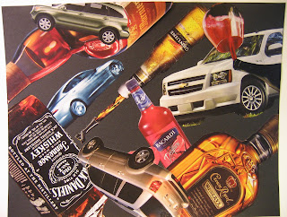
Objects in Space


Our assignment was to create a collage of two kinds of objects in space. They needed to be of various sizes and the composition had to be open, so that some objects continued outside of the picture plane. The purpose was to invoke a third idea that was not present in the composition. This was a fun project, although the glue can be a little sticky at times.

Sunday, January 3, 2010

Art Foundations -- Value Study

Volcanic Glass


Our assignment was to do a non-objective value study in graphite with five distinct values. I call this Volcanic Glass, after images of the volcanic glass crystals that are created in every volcanic eruption. This drawing was done very early in the semester, but note the black around the edges of the drawing. I term this the void. It sometimes creeps into a composition, just as portions of the compositional subject sometimes escape from the picture plane into the space around it. The void will also show again in later compositions.

Art Foundations -- Blind Contour Drawing

Blind Contour


This drawing was done with my non-dominant hand and without being able to see the sketchbook while I was drawing. I was pleased with it. It has an interesting shape and balance.

Art Foundations -- Background/Foreground

Ordered


This is the ordered composition. I wanted something that was stronger and more dynamic. With the square that I started with, I think this was my best option.

Saturday, January 2, 2010

Art Foundations -- Foreground/Background

Random


We did some work in compositions with foreground/backgound reversal. I completed two compositions: random and ordered. To complete the random work, I created a random number generator and used it to select the order of the individual squares. The odd thing is that the order did not turn out very random.

Art Foundations 107

I have just completed Art Foundations 107. It has been an interesting semester since the BSU Art Department is undergoing its decennial departmental accreditation. In class, as soon as our work was complete, it was whisked away from us and not returned. We wondered if we would ever get it back. At the end of the semester, some of it was returned so I'll post some images in subsequent postings.